background
Music allows for self-expression and constant growth. Since people have different singing styles and are interested in playing instruments in different genres, there is always room to learn and get inspired. With the creation of this app, musicians will achieve their goals in connecting and collaborating with other local musicians, as well as giving them a platform where they can quickly request to book gigs and RSVP to local events. This tool is essentially a network and a portfolio for local musicians.
My Role: UX/UI Designer
Technologies: Adobe Illustrator, Sketch

Pain points
Have not had success in meeting those with the correct skill level
Have not had success in meeting those who match the same musical interests
Have a hard time finding local events specific to their genre
Opportunities
Musicians want to be discovered by venues looking to book
Musicians want knowledge of local events
Musicians want ways to share their music and get noticed
Local venues said they would use such an app for booking artists
Problem Statement: Musicians want to find a way to collaborate with those who share the same musical interests, be booked and have the ability to request booking performance venues.
Personas

ideation
Several pages of sketching brought through discovery of design ideas.
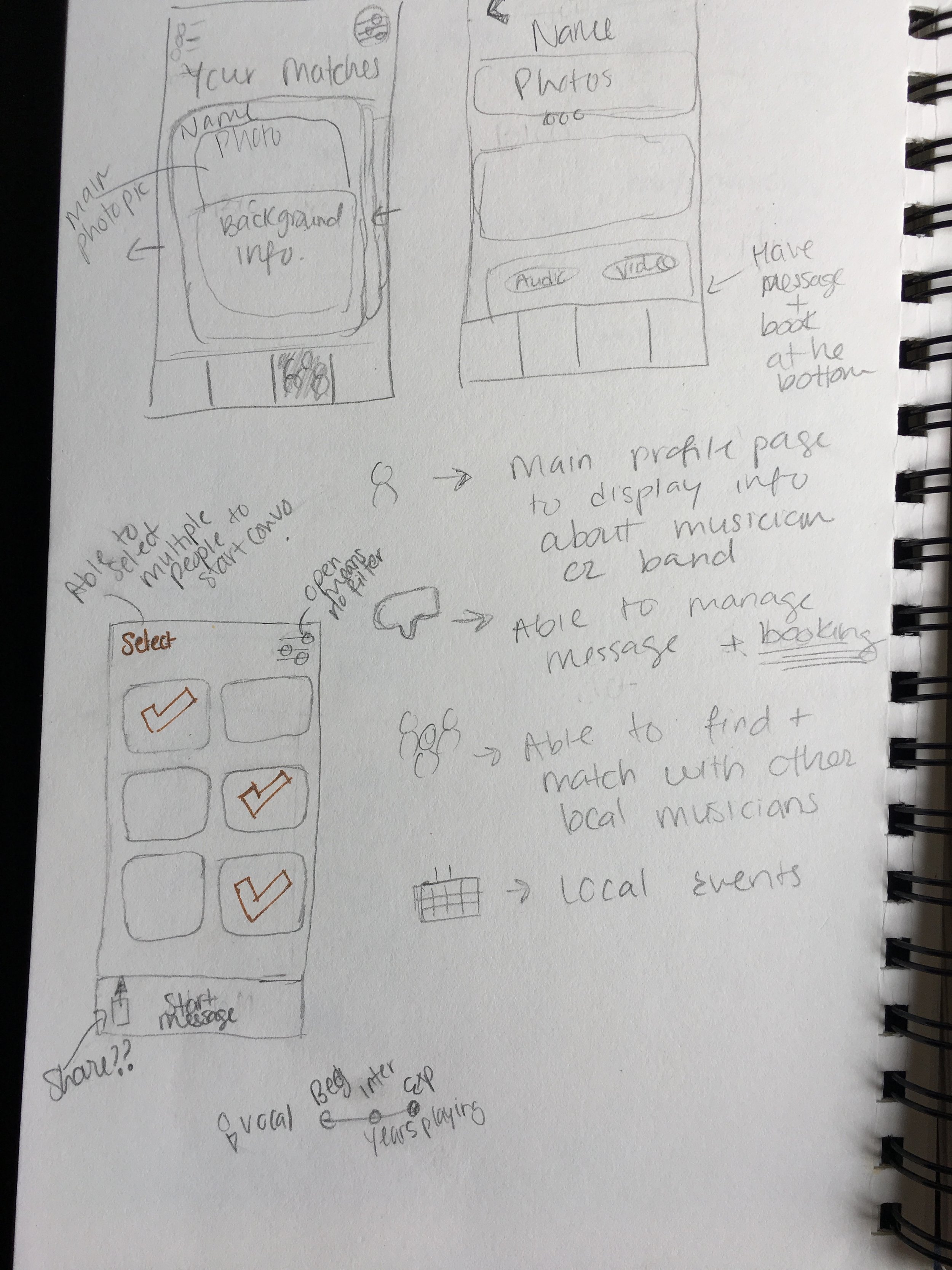
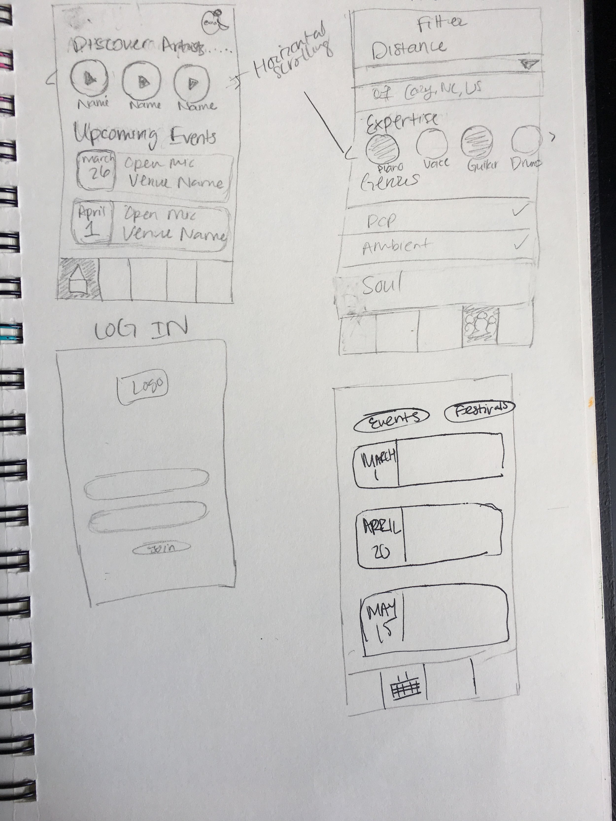
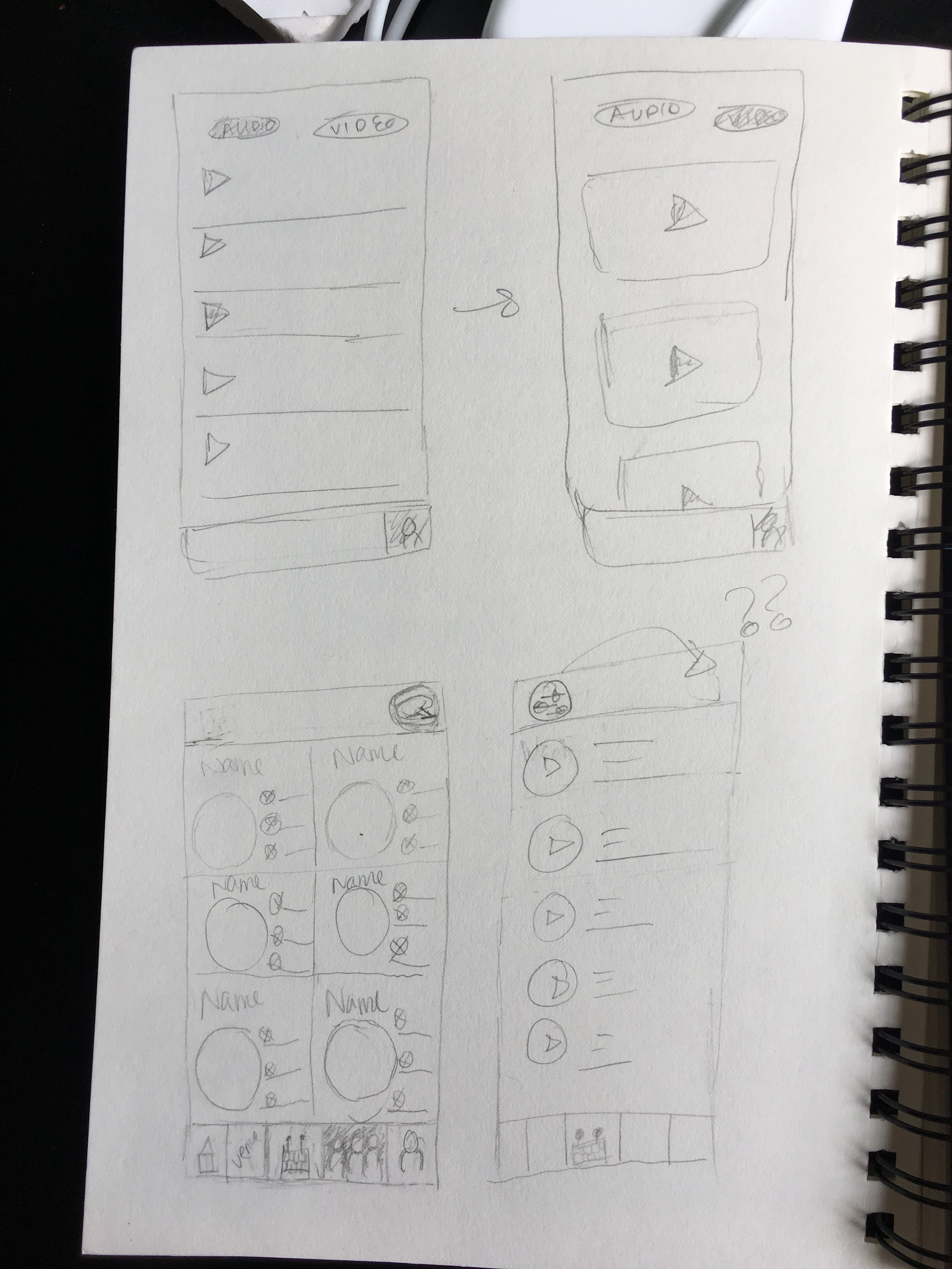
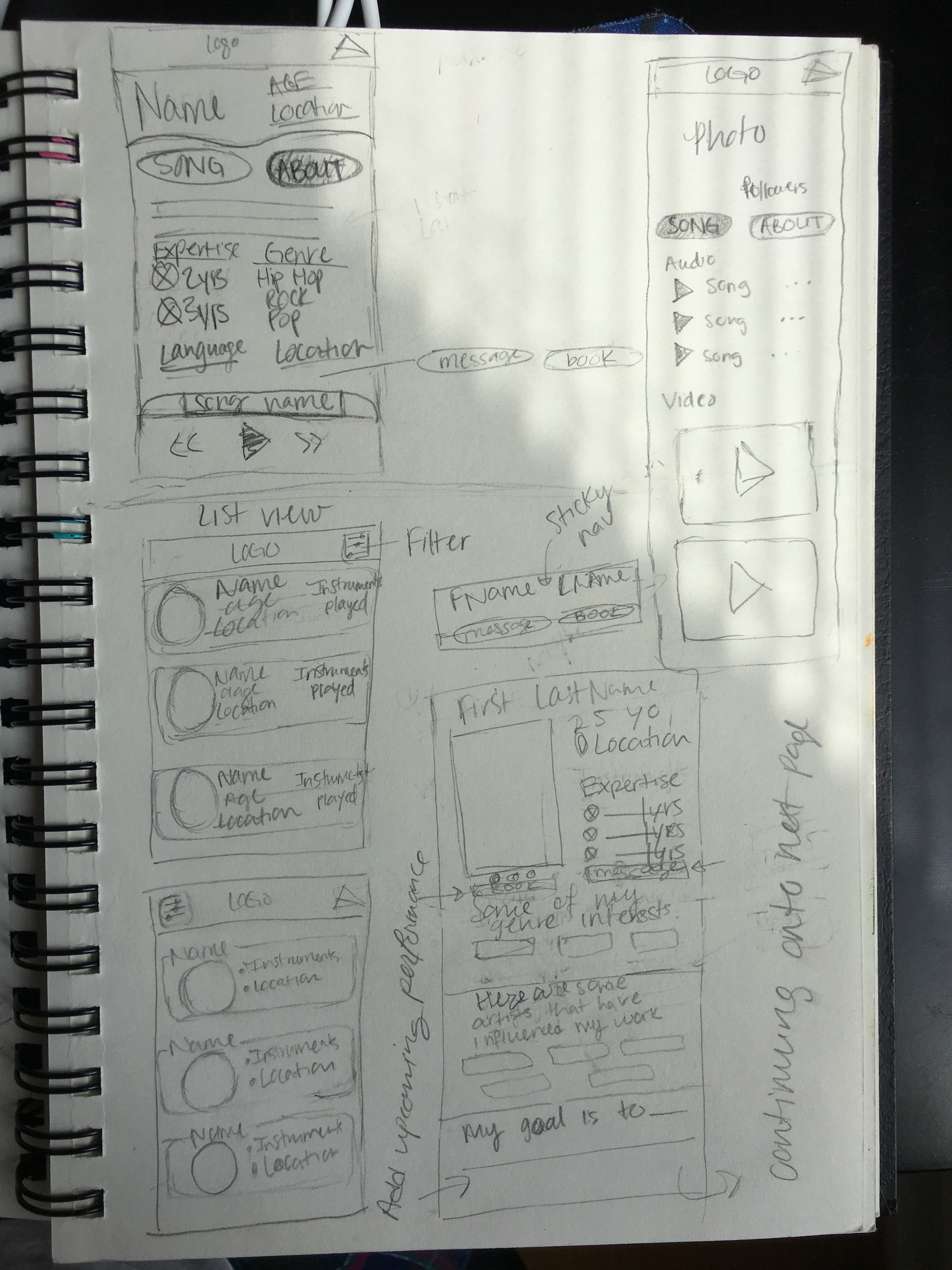
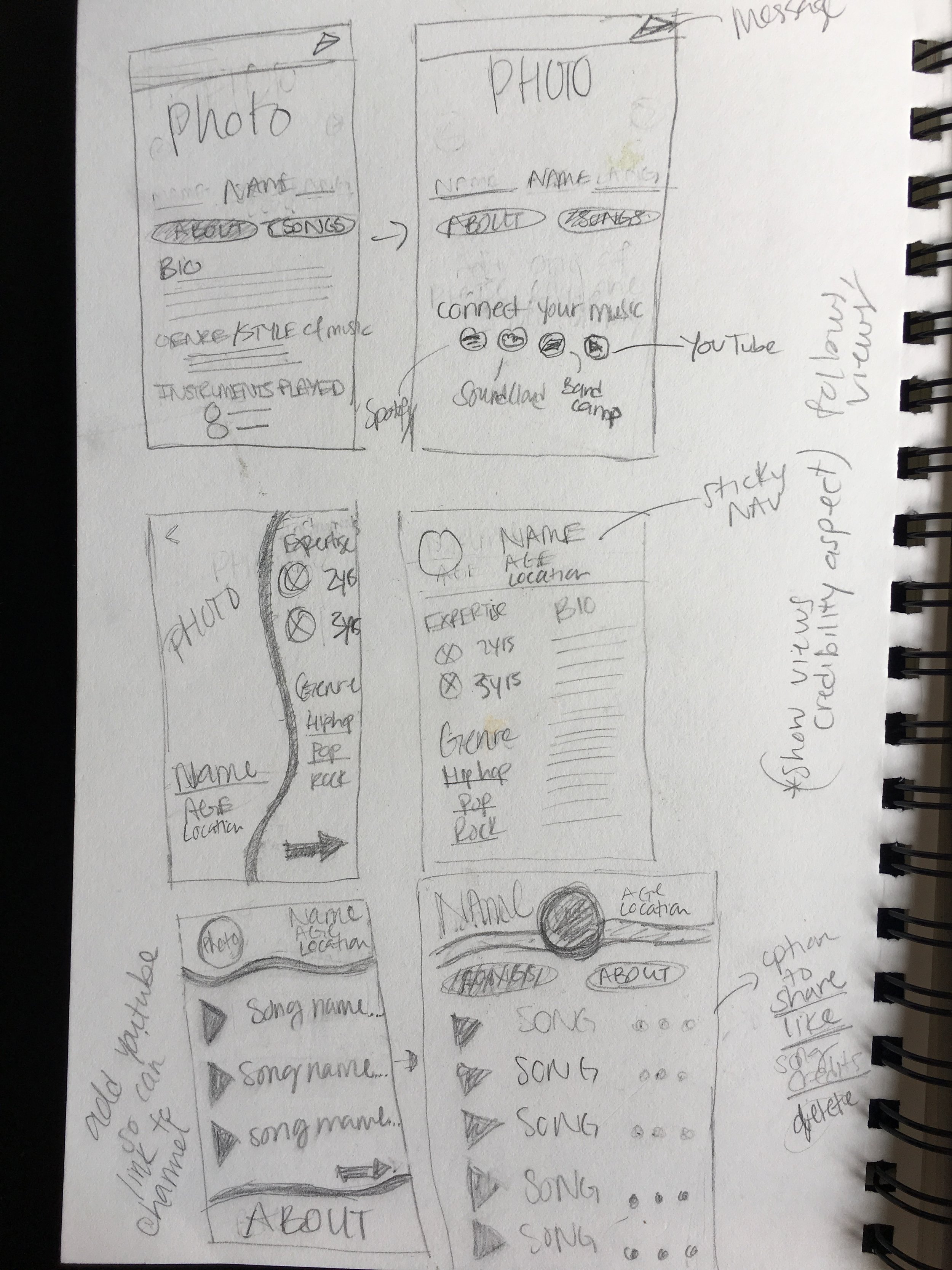
Finalized sketches transformed into interactive wireframes that were tested for usability.


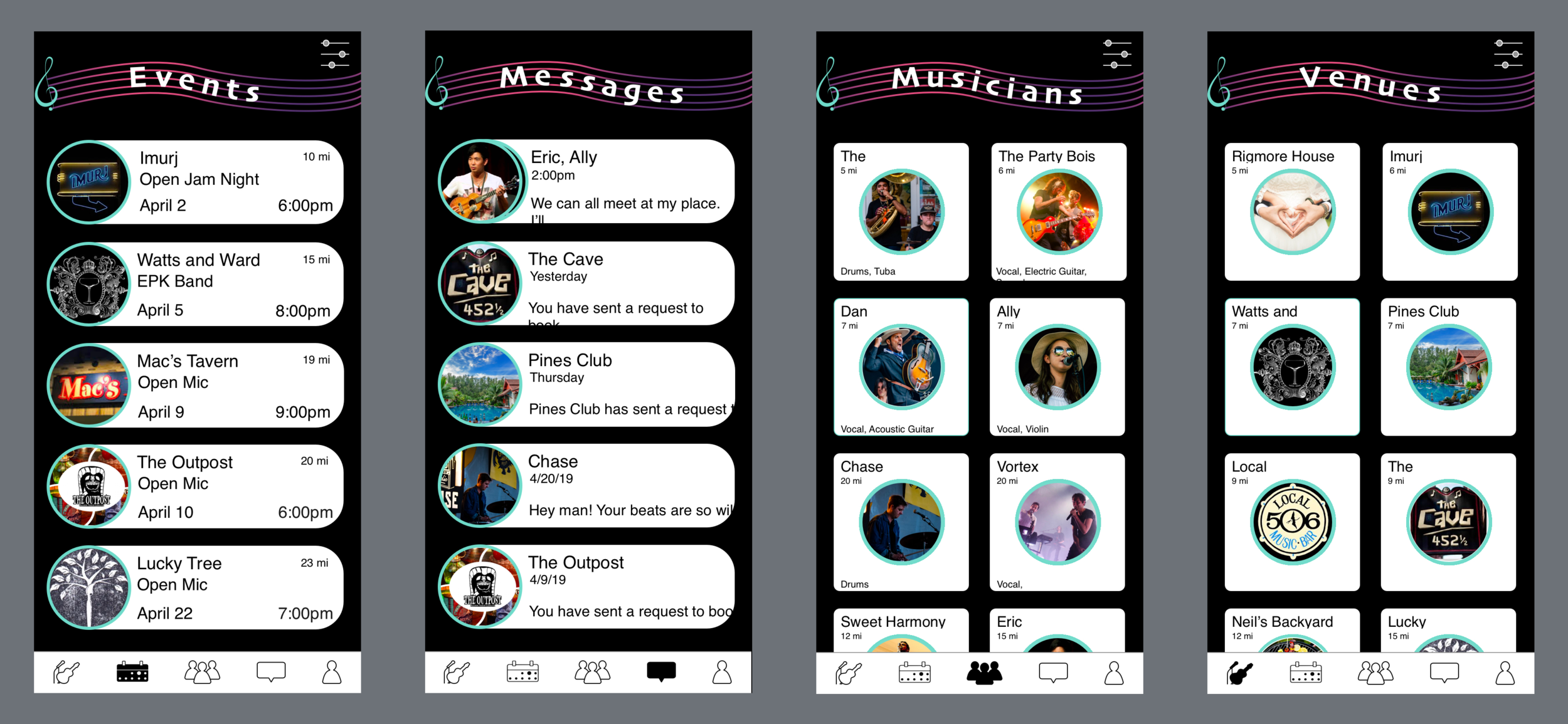
Five main functions:
Creating an account, finding local musicians, messaging, RSVPing for events, and booking venues
Tasks
method
WHO
Tested six participants who were musicians between the ages 20 and 50-years old.
WHERE
At locations accessible for both participant and myself.
WHAT
Participants were given six tasks with related scenarios that guided them through the five functions of the app. Each session lasted approximately 30-40 minutes. Before starting the test session, they were told the purpose and informed of the low fidelity wireframes. At the end of each task, participants were asked open ended questions as well as specified questions as per script.
HOW
Gathered data through observations, feelings, and think-aloud method.

Usability testing evaluated presentation of content, ease of use, iconography, navigational aspects, language.
Results

Task 1
Participants pointed out clarity was lacking in wording of these questions
“The icons are tasteful, minimalistic and get the point across”
Task 5

Participants found this icon in the menu to be misleading thinking it was a briefcase, camera or battery instead of a calendar

Task 6
When requesting to book a venue, all participants chose the date and time text boxes instead of their respective icons
visual design

Color & Type
After research, these six colors were chosen for brand.
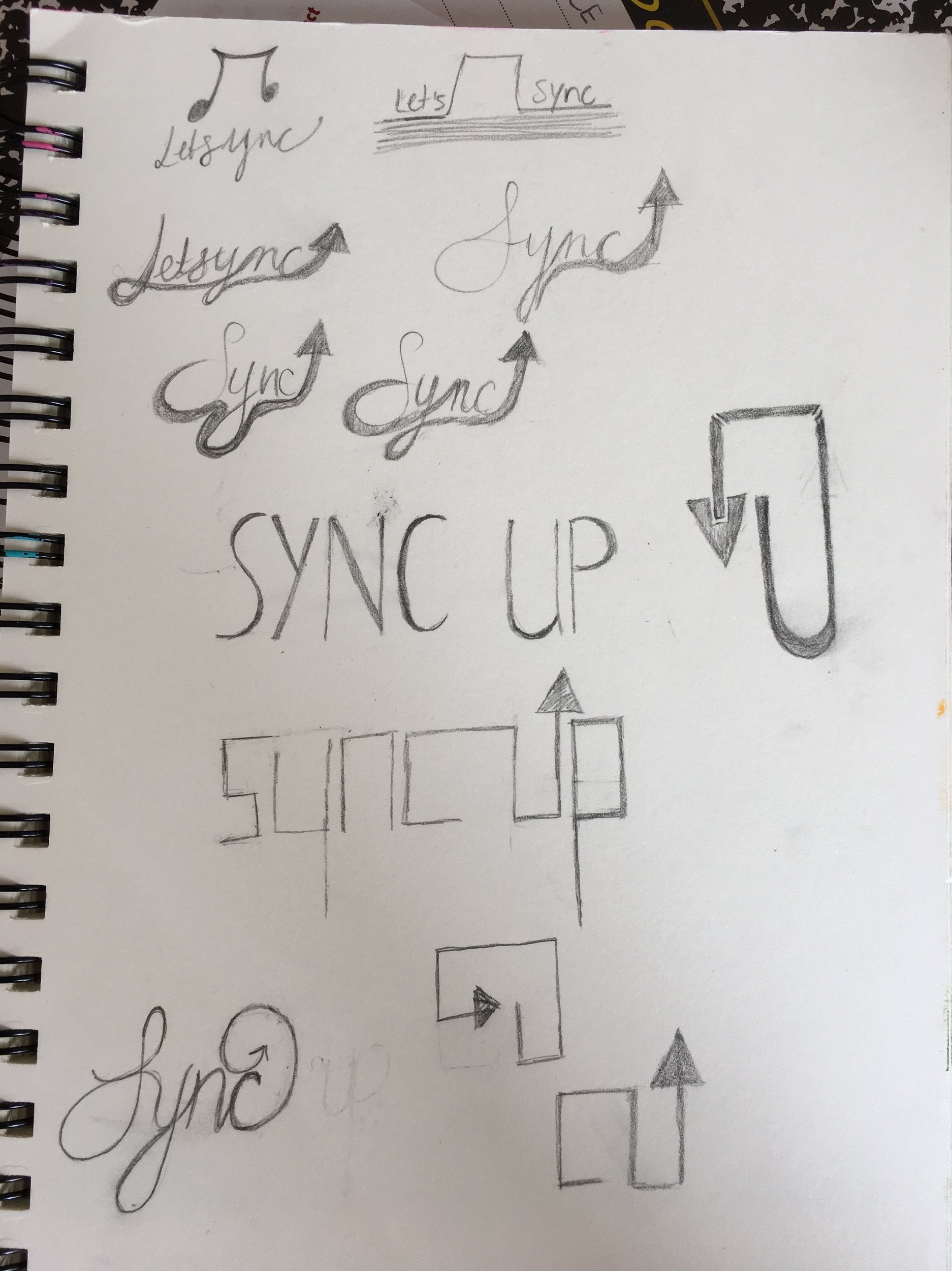


Final Logo
This logo was selected for its simplicity and connectedness.