
background
The Kindle mobile application is an alternative to an e-reader tablet and provides users with the opportunity of reading e-books sold by Amazon and previously purchased e-books. The primary function of the application is the reading experience.
I worked within a team of four fellow graduates to improve upon the overall reading experience of the Kindle mobile application. Our usability test focused on the ease of use the participants experienced while engaged with the reading portion of the application. This included highlighting, scanning the table of contents, changing the appearance of the screen and other features within the reading experience.
My Roles: UX Researcher, UX Designer
My Contributions: Notetaker and cameraperson during user interviews, captured the method to incorporate in testing and developed mockups for UI redesign
Technologies: Adobe Illustrator/Photoshop, MS Excel

tasks
method
WHO
Tested five participants who were graduate students in the Interactive Media program between the ages of 20 and 30-years old.
WHERE
A classroom in the Long building on the campus of Elon University.
WHAT
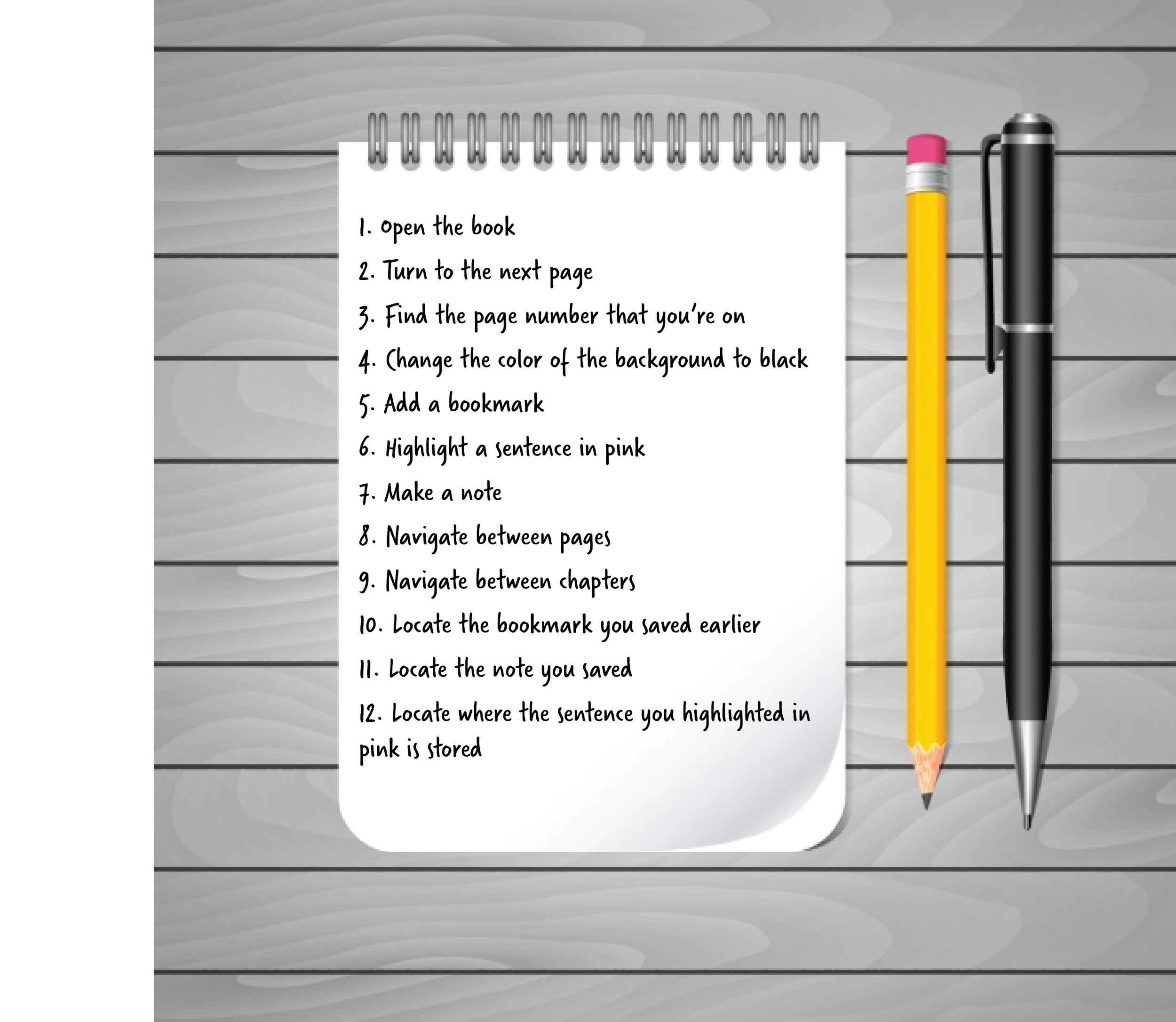
Conducted 12 tasks with related scenarios for each participant to complete in the e-book 1984 by George Orwell. Each session lasted between 6-8 minutes during which one group member was assigned the role of moderator and another member was assigned the role of note-taker. The data analyzed looked at the task completion rate, the number of errors occurred per task and their general reaction to each task.
How: Recorded subjects using the screen capture feature on the iPhone X along with recording subjects through audio and video recording via external Canon 7D Mark II.
Results
We gathered solely quantitative data because we were interested in how the application functioned rather than what users thought about the experience.
Task number two was disincluded from our results due to the varied nature of the proctor’s provided stopping point and the participants’ rates of page advancement.
Task number four was a notable outlier, with none of the participants completing the task. The failure to complete this objective was a result of all participants becoming frustrated after attempting nearly every option available and voluntarily leaving the task undone.
Task number ten was missed by one participant due to an oversight rather than an inability to find a solution for the requested action.
Tasks number six and seven also took an extended amount of time, but for varying reasons. While some participants’ times were extended due to errors, others took time to choose which content to utilize for completion of the prompt before attempting to locate the correct interface controls.
The general increase of time taken to complete tasks eight through twelve were not necessarily due to an increased complexity, as these tasks also had a “long way” which was unaccounted for in the phrasing of the task.


“It must be in settings, but I don’t see anything in settings.”

We defined error as any action taken that did not go toward completing the given task. If the user were to backtrack from their extraneous action, we did not count that as an error. For example, if the user opened the hamburger menu instead of turning a page, then closed the hamburger menu, we would only count this as one error.
The lengthy exploration time on the task number four increased the number of accumulated errors.
RECOMMENDATIONS
Task number four, instructing participants to change the background of the e-reader to black, had the most number of errors and was left uncompleted.
Participants ignored the icon “Aa” which, when clicked, allows the user to change several typographic settings as well as editing the color of the background.
Replace the “Aa” icon to be a settings or “gear” icon.
PROBLEM

Solution

Tasks 10 & 11, instructing participants to locate their highlight, bookmark, and notes proved somewhat confusing to users due to phrasing of task as well as the iconography. We hoped users would open “My Notebook” to finish the tasks successfully, although the icon seemed to be visually misleading. The current icon appears as a page in a book, not a storage place where highlighted lines, notes, and bookmarks are stored.
Replace the current icon with a symbol more commonly associated with storage, such as a “folder” icon.
problem

solution

It was found that having multiple menus (both a hamburger on the left and a top navigation bar) became confusing to users and resulted in repeated errors in an attempt to complete the tasks.

