
Background
Migraine Monitor is an application that allows individuals, suffering from migraines, to track their triggers and treatments, record their symptoms and connect anonymously with other migraine patients. Users also have the ability to allow their doctors to monitor their migraine care through an online dashboard.
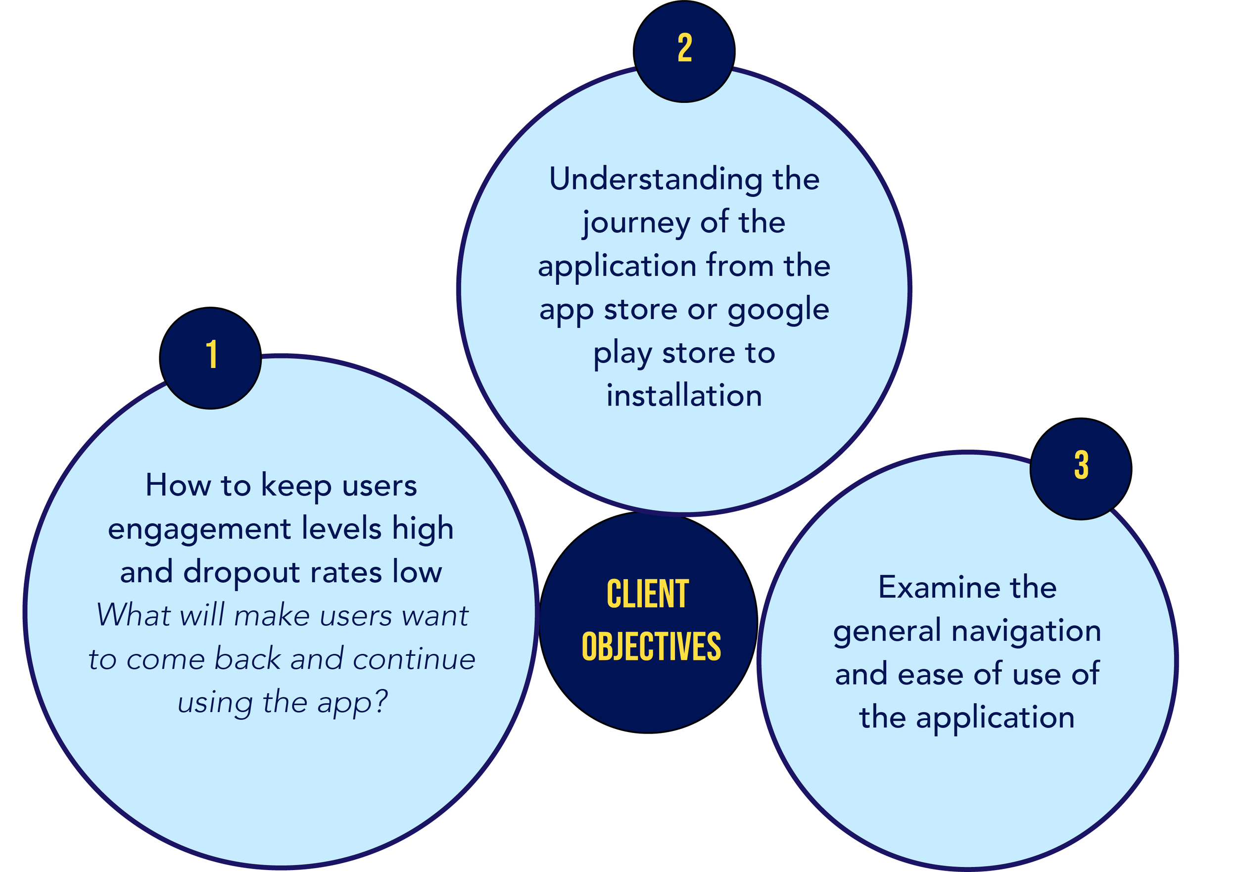
Myself and four other UX Specialists worked within a tight deadline to meet clients objectives. We examined users’ impressions of Migraine Monitor (MM) within the app store as compared to Migraine Buddy (MM’s biggest competitor), their engagement levels, frustration points, satisfaction in regard to ease of use as well as users recognition of the iconography.
My Roles: UX Researcher, UX Designer
My Contributions: Notetaker during user testing sessions, generated questions to ask participants during testing for all tasks, gathered plus analyzed results data, and developed mockups for UI redesign
Tools: MS Excel

persona

Preliminary research revealed…
The average age of health tracking application users to be between 20-50 years old, the majority of migraine sufferers to be female, and common activities for females in that age bracket to be yoga, jogging, or related social activities.
tasks
method
WHO
Tested four participants between 20-25 years old who experience migraines at least once every few months, and have not used Migraine Monitor or Migraine Buddy. Participants were asked to complete a screening questionnaire to ensure they met the above stated criteria.
WHERE
The Innovation Lab located in the Long Building at Elon University.
WHAT
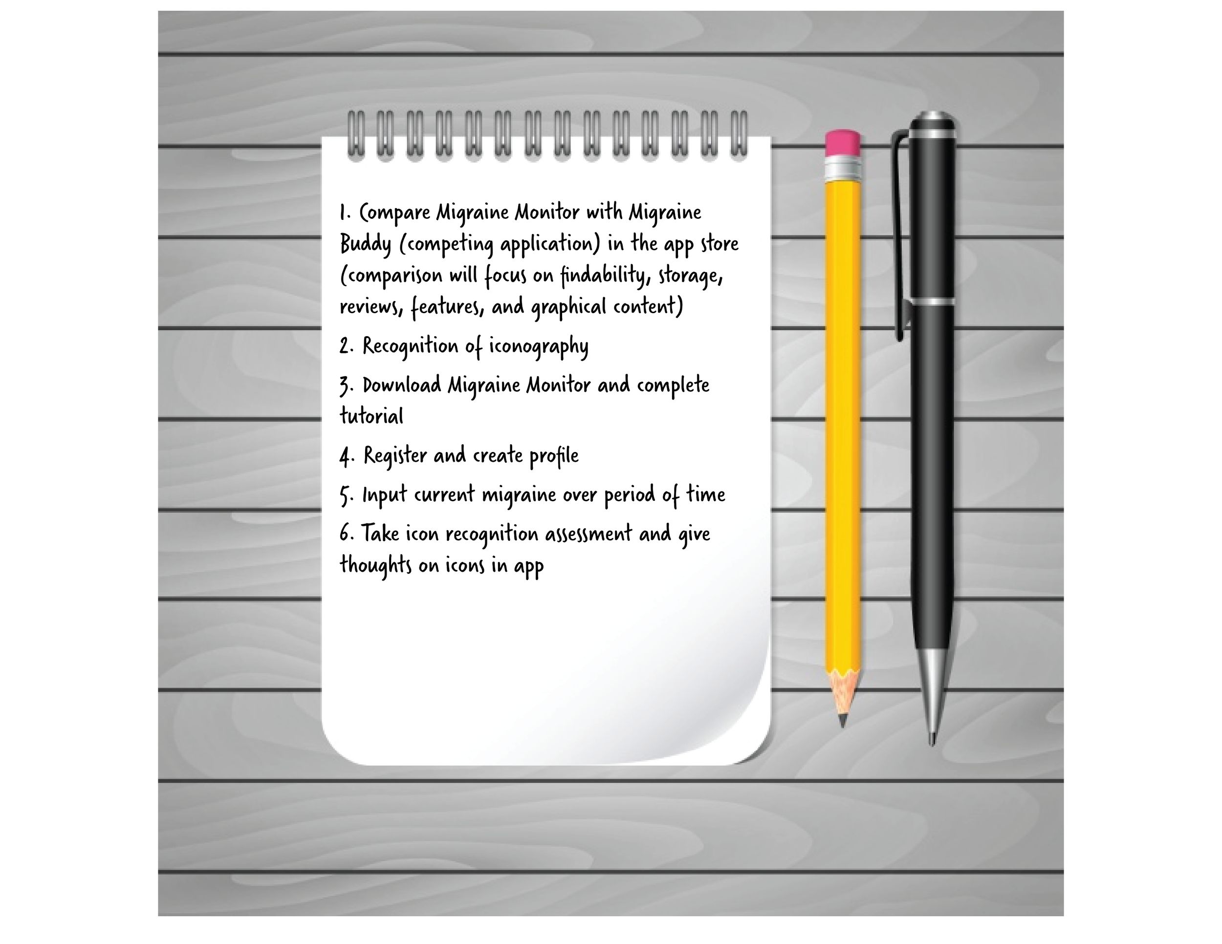
Participants were given six different scenarios and tasks that guided them through the app unbiasedly. Testing sessions lasted approximately 40 minutes each. Before starting the testing session, each participant was provided a Consent Form. Each participant was guided through the various tasks outlined in the according to the Task Script and were provided with a questionnaire and open ended questions after each task.
HOW
Gathered data using the screen capture feature on the iPhone X along with recording subjects through audio and video recording via external Canon 7D Mark II.

Task-End Questionnaire
Captured behaviors, feelings of participants after they completed each task.
results
We gathered both qualitative and quantitative data to capture a breadth of results such as: users’ feelings, motivations, measurements of satisfaction and frustration, initial reactions, and task completion time.
Task 1
Each participant was able to successfully locate the app without error
3/4 participants thought MM color scheme & screen design was more appealing than MB - stating it appears “clean, crisp, & calming”
All participants noted that MB has more reviews and higher ratings than MM
(MB 4.8 stars with 14.7K ratings) (MM 4.1 stars with 48 ratings)
2/4 participants stated that they would likely not use the doctor component, they don’t want to communicate with their doctor through an app
“Clean, crisp, & calming”

Task 2
Before using the app, participants pointed out…
Icons they recognized
Icons they couldn’t guess the meaning of
Icons that were similar


Task 3
All participants found that the downloading process was easy and simple to achieve
Participants found some components of the tutorial were not presented in a linear/organized manner
All Participants expressed that Migraine Monitor’s tutorial was overwhelmingly long


Task 4
All participants had to recreate their password several times during registration
2/4 participants selected different tabs and feature before finding setting reminder time to log headache toggle
Two participants displayed furrowed brows and concentration while adding in medications
Participants lost time in scrolling to find the medications they were tasked to add
One participant let out a deep sigh and groan expressing frustration for not being able to see what characters were entered for password fields and not having any of the details needed to create a password


The optimal time for completing this task is 2 minutes although participants exceeded time with with the average of 3 minutes and 44 seconds.
Task 5
Participants expressed verbally that they liked the clean presentation, and that setup was easy to follow
A majority of participants found the linear structure of adding and recording a headache made this task easy
Some participants showed physical signs of leaning, frowning, and verbal frustration
Finding the report/details page of completed migraine was the most frustrating part of the task
Presentation of the results were confusing, some participant went to the ‘Calendar’ and some went to the ‘Report’ screen which did not provide the full summary of the migraine they just entered

Task 6
Icons that were guessed correctly after using the app…


Icons that were not correctly guessed after using the app…
Participants noted generally being confused by the similarity between multiple icons
Icons that were underperforming after using the app


