
background
Cisco Systems, Inc.
The Multiplier Effect is a pledge, a personal commitment that encourages leaders at all levels to sponsor at least one extraordinary person different from themselves for career advancement and to challenge their peers to do the same.
My Role: UI/UX Designer
My Contributions: Work closely with product owner, tech lead and content strategist in a fast paced environment to redesign a solution for a diversity and inclusion initiative. Create user flow diagrams, wireframes, and high fidelity interactive prototype in Figma. Drive the development and communication to clear design guidelines, patterns, and assets. Assess hi-fi designs with the test engineer to certify they met 508 accessibility compliance standards.
Technologies: Figma
Research
Exploring existing application
Understanding the user flows for existing version
Sponsorship documentation
Setting up time with SME for knowledge transfer
Wireframes
I began by designing at a high level the happy path for a sponsor. The user requirements were provided from the program manager and tech lead. The data on these screens went through approval of senior management.


Color Scheme
Color palette I used for the creation of visuals and other components in this project.
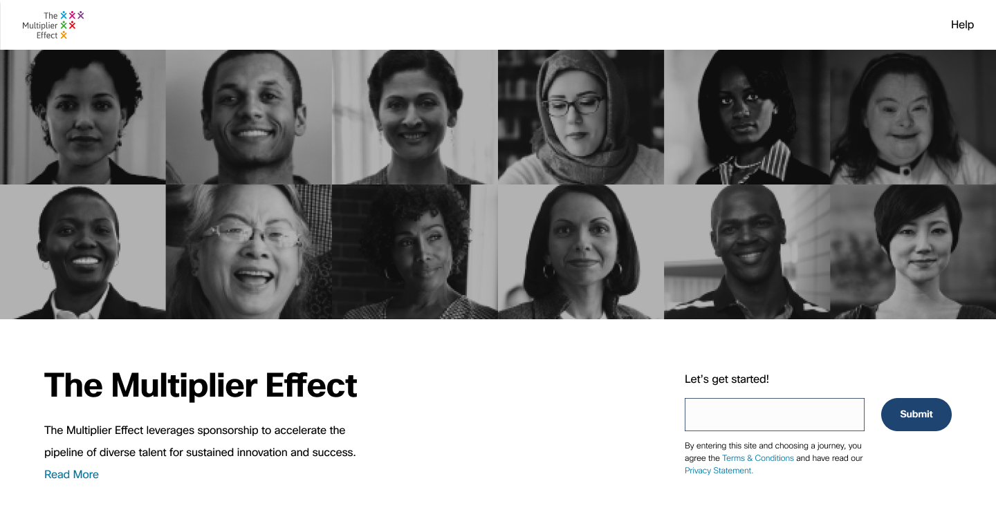
LANDING SCREEN
The landing screen required a brief description, a place for users to submit their Cisco email address to get started with their multiplier journey and an all-encompassing hero image. After much digging, I chose the below four options representative of The Multiplier Effect and sent them to the manager who socialized with seniors. Total of 38 votes came back as follows: 9 - Option A, 6 - Option B, 6 - Option C, and 17 - Option D (the clear winner).
Option A

Feedback:
“Keeping with the emotion I associate with TME. Very Simple.”
“I feel what will enhance the content and the pictures is to clearly identify the diverse audience.”
Option B
Feedback:
“I personally like “B” as it also includes representation of our disabled communities.”
“I really like this one, but I do think there could be more subtle skin color differences than just the two depicted.”
Option C

Feedback:
“I really dislike the way all their arms are crossed across their chest.”
“It is all women and only one man… I don’t think it is diverse.”
“It would be nice to “C” represented to be more inclusive.”
Option D
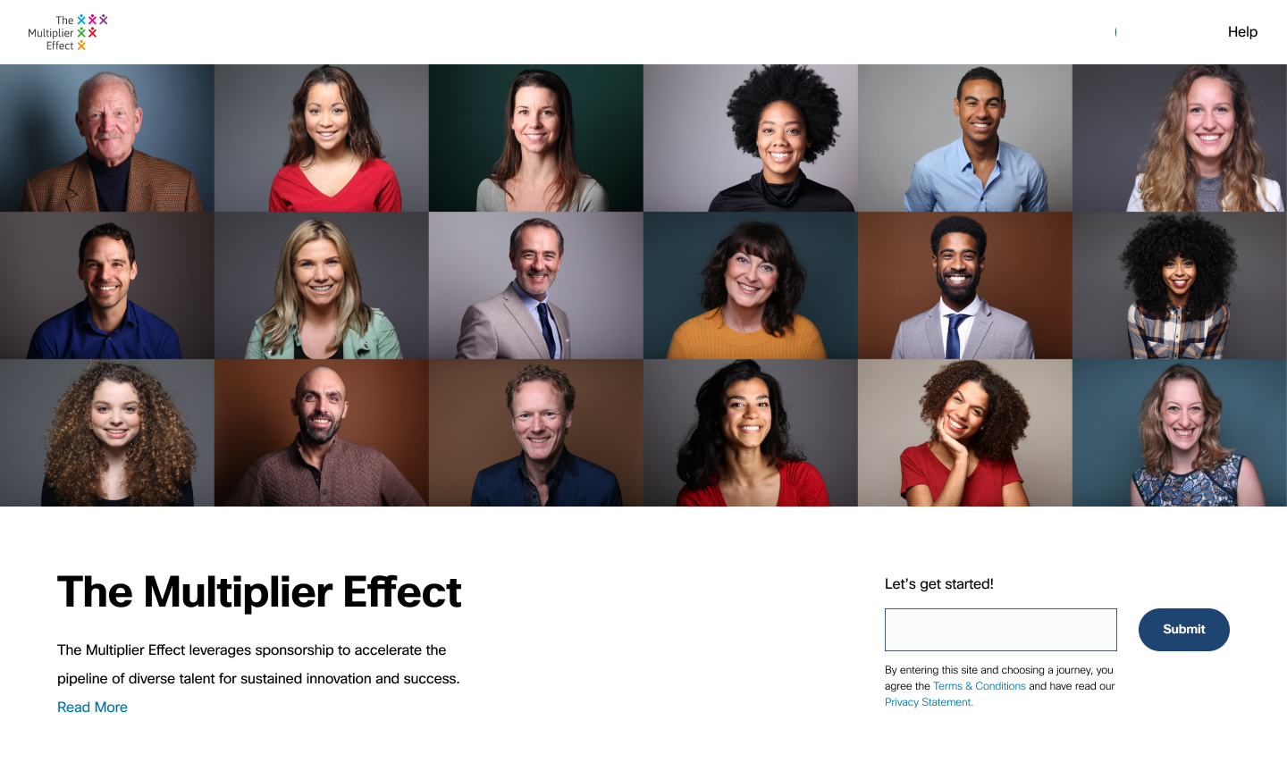
Feedback:
“I like the boxes in “D” because that is how we are living and working right now.”
“It would be good to include a veteran, a person with disability, a person with glasses, a person that’s full-figured, someone gender fluid, a person with Asian features.”
ABOUT SCREEN
User flows
I researched the existing user flows for sponsor and sponsee and recreated that to align with the new redesign.

